Joanne & Elena Gogou’s amazing new comic The Gimmick debuts in March 2023 from Ahoy Comics. I had the pleasure of being asked to do a variant cover for the first issue, and I obviously said “YES!!!!” with many exclamations. Wanna know how I did it?? Keep reading!
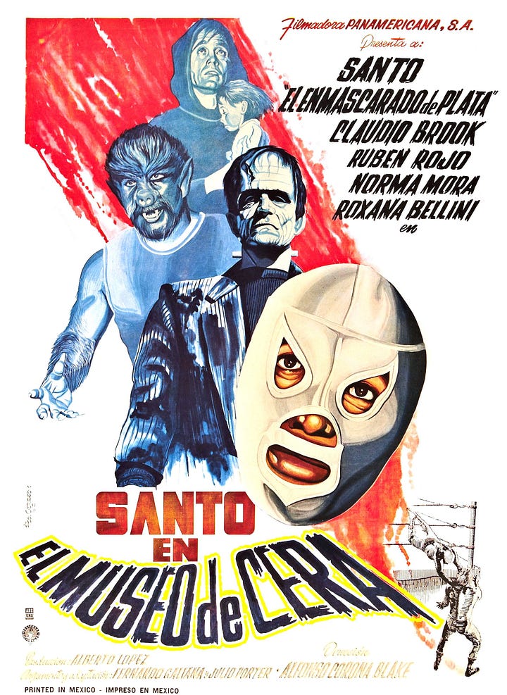
As soon as I read the debut issue I knew what I had to do. I immediately had 2 ideas in mind for this cover: A) a lucha libre promotional poster, or B) an homage to the Santo movie posters from the 60s.


I mocked up one of each.
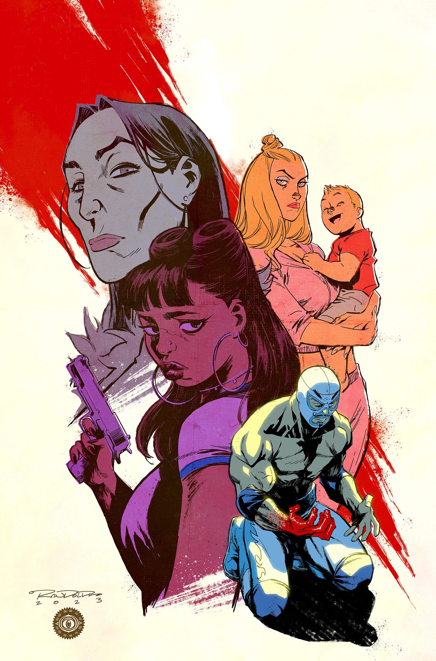
The ensemble cast is what makes this book shine, so I tried to showcase them as much as I possibly could. Joanne preferred the second one, as it really highlights the women in Shane’s life and how his poor decisions affect them in different ways. I agreed, because Joanne is pretty much always right.
At this point I digitally penciled all the figures in and do all the correcting of anatomy, expressions, grabbing reference for the gun, etc. In the original layout I was much more concerned with Shane’s acting than drawing him properly, and he was pretty scrawny. I had to beef him up thoroughly and shrink down his head to give him the proper John Cena-esque physique that I was aiming for.
Inks are done! For the linestyle I went for the messier ink line that I employ on Sirens of the City. Elena is the main artist on this book (and boy is she good), but since this is written by Joanne I wanted to evoke a little bit of that Sirens magic on it.
Color! From the jump I knew that I wanted to use a technique called “color blocking,” where instead of coloring everyone in natural light, each figure would be dominated by a single color that evokes an emotion. Sam (on the left) would be purple, which would denote a mixture of sadness and angry. Shane is swathed in an anguished blue, with a yellow highlight that would hint at a possible redemption. You get the idea. Now at this point you’re probably thinking “boy, are these colors are overly saturated,” and indeed they are! But there’s a reason for that…
WEATHERING! This is a technique I’ve use quite often in the past when I wanted an image to feel timeless, or from a bygone era. It’s basically just scanning in beaten up pieces of paper and various textures and throwing those layers on top of your image to make something feel old and yellowed. It tends to fade the colors you use so you really have to punch up your initial colors beforehand.


I kept Shane “un-weathered” so that the background characters would feel like they are part of his past, and also so that he would pop more. Joanne also suggested that Bonnie (top left) was too green and Poison Ivy-esque, so I desaturated her way down to really recede her into the background. Lastly I put a light yellow glowy halo on Shane to push him forward even more.
And there you have it, another cover in the books! If you’d like to know even more about The Gimmick, click on this previous post. I highly recommend picking it up when it comes out, as it’s a fantastic read. I hope you enjoyed this little break down of my process. I like to do this fairly often, so if you’d like to read more feel free to subscribe!


These are the posts I love too! Thanks for taking us through your creative and work process, Khary!