(Lettering) Tail of Two Cities
A look into the lettering style of Deron Bennett
Joanne and Khary invited me to talk about lettering for Sirens of the City and A Way from Here, so this week you get a special behind-the-scenes from yours truly, Deron Bennett. I frequently get asked about my approach to each project I’m working on. “What am I looking for to determine style?” “How do I begin each project?” So, I want to detail how I arrived at the look for both comics. I take varied approaches to placement and lettering conventions to give the reader a different experience when reading the two stories. We have two distinct lettering styles for a reason, and the way they were developed is as follows.
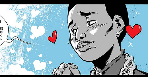
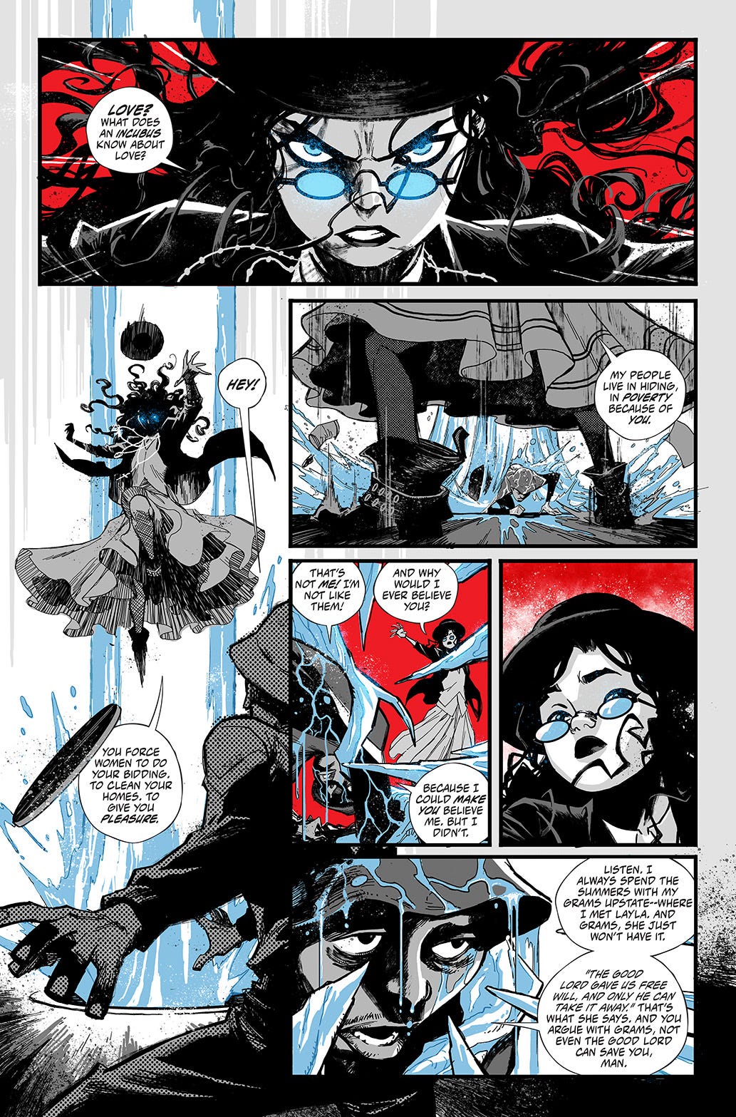
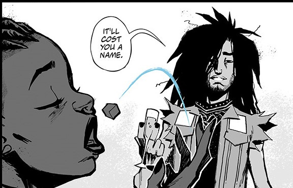
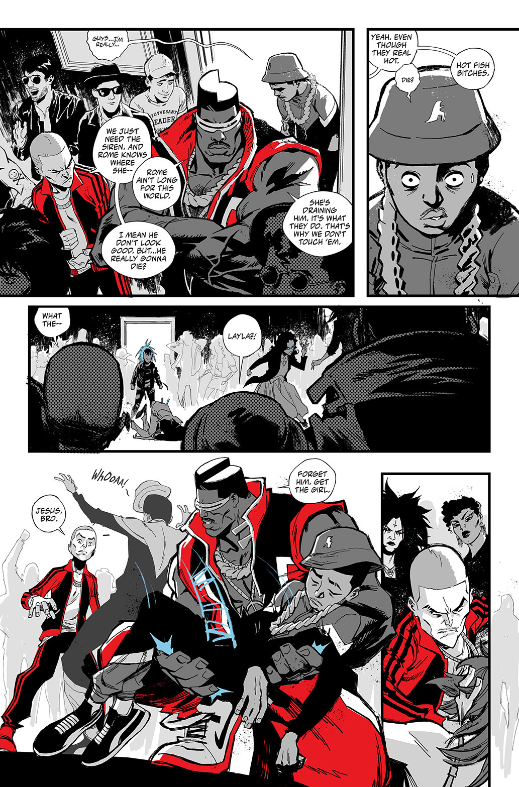
When we first started discussing Sirens, Khary mentioned that it would be done in black and white. I’ve collaborated with Khary on a couple of projects. Still, he threw a curveball with this one by switching up the style just enough. Khary’s work is still as expressive as ever, but the lines aren’t as simple and clean as he usually makes them. Plus, we have the pure black and white element going. Once I got the test pages, it dawned on me to tackle the lettering as if I was doing manga.
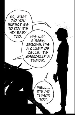
I’ve been lettering manga since I started in the early 2000s, so I knew exactly what I wanted to do. I went with taller, irregular circular shapes. Since Khary was going to be a bit looser in his style, the balloons are intentionally imperfect to reflect that. The font had to feel like it was done with a nib instead of a marker or rounded tip. The same is true of the sound effects. I wanted them to either have the feel of a brush or nib like they do in a typical manga.
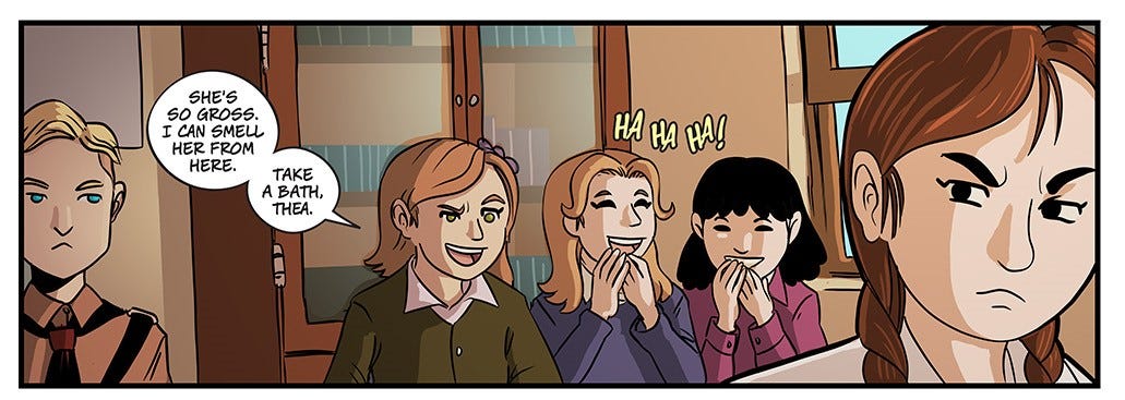
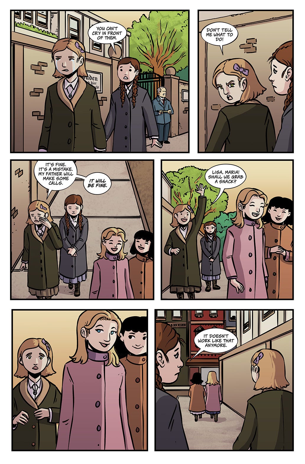
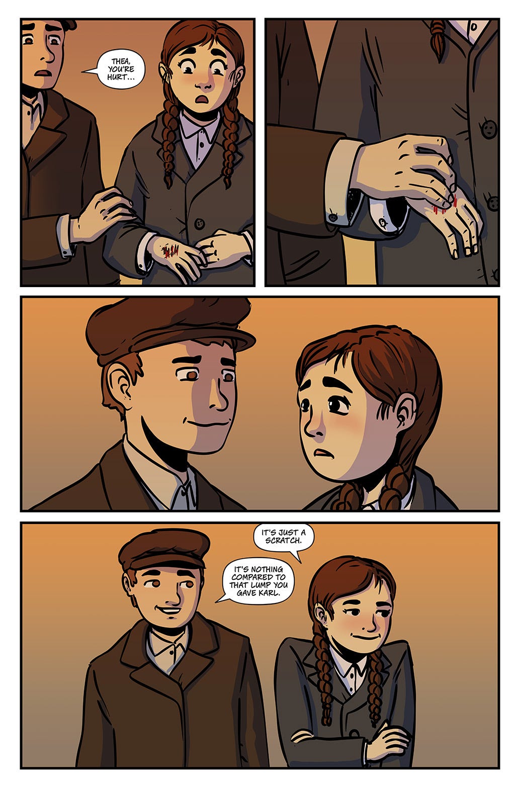
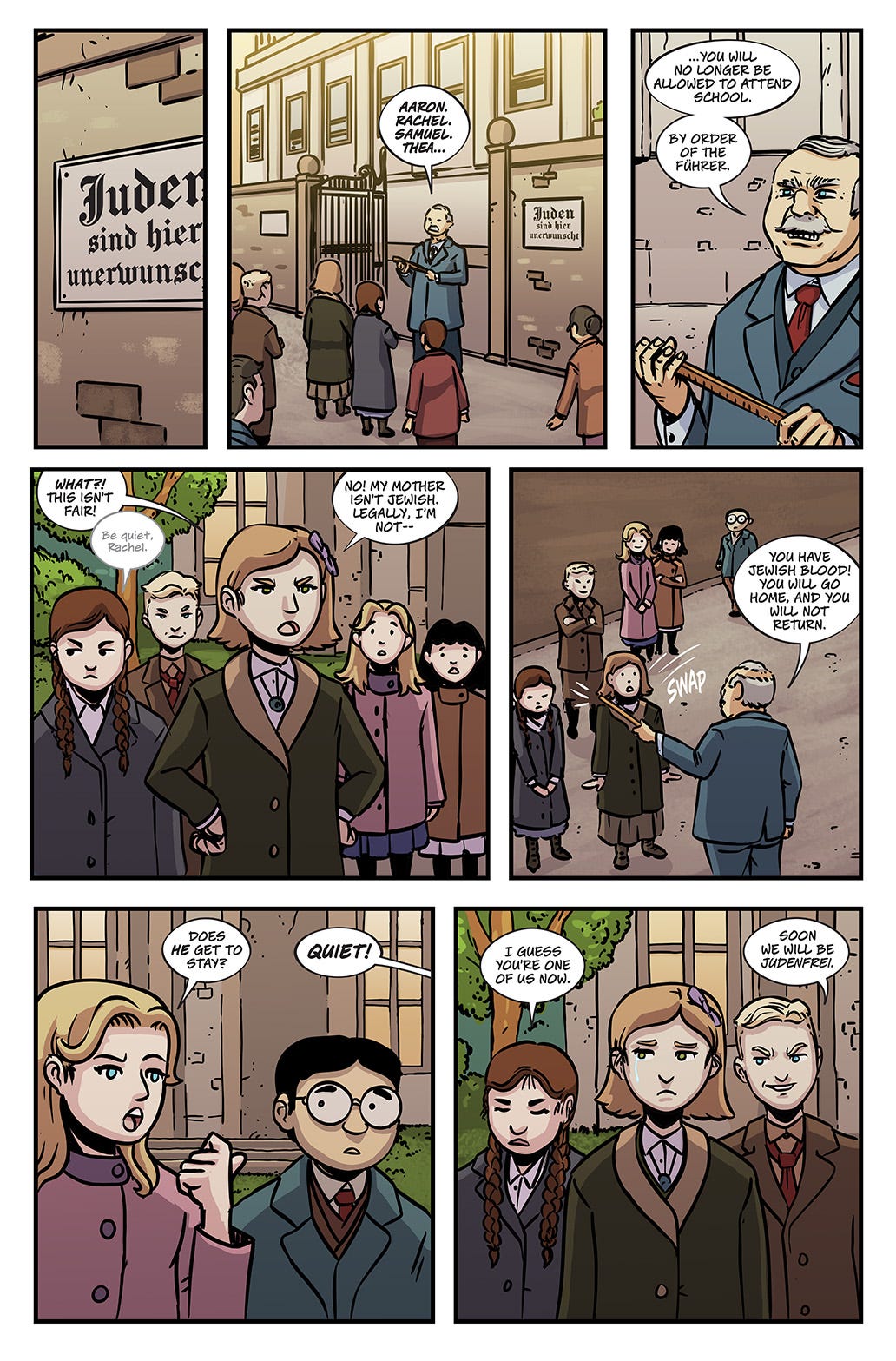
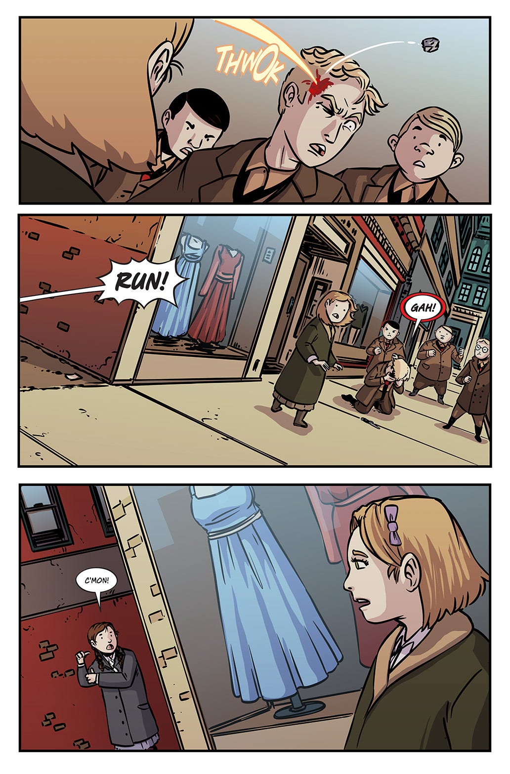
Conversely, Gabe’s work in A Way from Here is simple and clean. Since I love it when the lettering looks like the artist did it, I initially thought of using Gabe’s own font for this project. Unfortunately, the font didn’t quite fit, but I used it in some sound effects as an Easter egg. In the end, I chose a font that still looked like it was done by hand to make it work. Fortunately, it also had some technical advantages, including a lowercase version that I could use for quieter moments.
The thing that stood out to me with Gabe’s panels was the rounded shapes. There’s a softness at play here that I wanted to be incorporated into the balloons. All of the balloons have a rounder, more oval shape. I intentionally avoided using what is known as “TV” balloons to coincide with the feeling I was getting from the art. When we had to put together part 9, I was on vacation, so I had a member of my studio do some fill-in lettering. You can notice how the balloon shapes have changed to the more TV-shaped balloons. It still works, but it’s less evocative of the approach that I set out with. These are some things you can look for if you’re ever trying to figure out if a book has a new letterer!
As mentioned, some more subtle things I do might go unnoticed when developing the style. Someone recently pointed out a tail I did for Sirens 011. It got me thinking about what else I’m doing with the tails. I use the tails to determine more who is speaking. One of my favorite tails is something borrowed from manga where the tail is partially angled. I incorporate a lot to give some personality to the lettering.
The tails in A Way from Here are more straightforward. I made them a bit wider to fit with the openness of the art. That’s another thing that helps me to determine styles. Gabe plays with open space. For the most part, balloon placement is determined by the area he leaves open. Everything flows left to right or top to bottom.
With Sirens, the panels contain a lot of detail and the backgrounds are a natural part of the storytelling. The thinner tails, tighter balloons, overlaps, and masks are all done to help keep those backgrounds intact and uncovered.
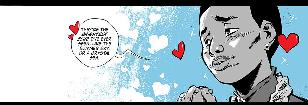
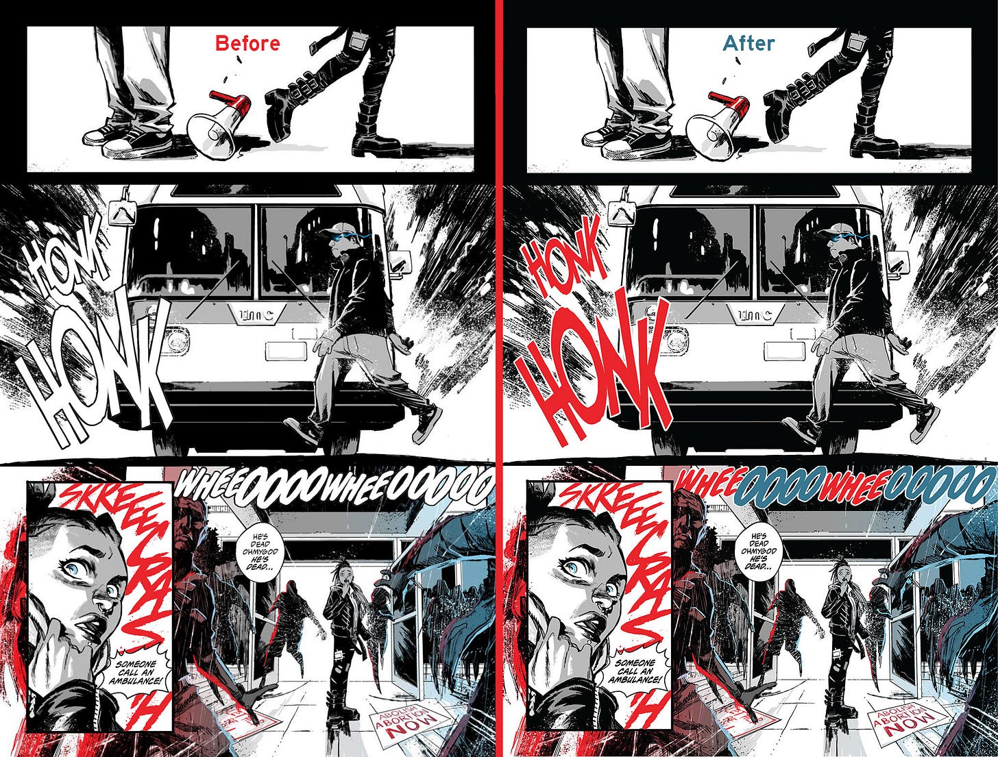
Obviously, when it comes to color I have go down separate roads for each. Fortunately, Sirens uses splashes of color that I can use to my advantage. But I try not to get heavy-handed with it. In fact, one of my original pages was a bit too conservative. The team pushed me to add more color and it turned out better by leaps and bounds.
I get a little more flexibility on A Way from Here, where I can use some different tones depending on the art. I still stay within the color palette, but I can use a lot more range for sound effects to pop off of the art. Or in some cases, work in tandem with it.
From Khary - y’all got an education today! I sure as heck know I did. Much thanks to Deron for writing this up for us. Here at Glass Eye we work with the best people in the biz and they all have lot of knowledge to share, so let us know if you guys would like more guest posts in the future!




I loved Deron's post. I don't appreciate letterers enough so posts like this help change that. I vote for more guest post in the future. Thanks!